


The Funk it up Rule
How to not fall prey to boring interiors

Happy Friday and welcome to this short, semi-sweet post on the f**k it up rule. This “rule” — quotation marks because there are no rules (duh) — applies to both fashion and interiors… maybe even life itself if Ms. Frizzle taught us anything.
It’s the flare that keeps a room from looking overly designed or too off-the-shelf if that makes sense. You need jazz. A little zing. A not so obvious detail that brings a room to life.
Method 1 - Color


Remember the (ongoing) craze for a pop of red in your outfit? Fashion epitomizes the f**k it up rule. Take Leandra Cohen for example - the queen of funking it up and layering pieces of different color, texture, and form that when finalized simply makes sense (and locks me in a 5 minute stare and study). The outfit above is a tame example, so run to her Substack or Instagram for the best inspo. In the image on the right, I poorly photoshopped her handkerchief to match her sweater (it felt blasphemous for sure) which immediately stunted the look from fab to drab; whereas, her original outfit is perfectly imperfect.
Red is the most common color method to f**king up a design. Because it’s so strong, I’d recommend using the color in small doses for fear of it becoming too intense and overpowering a room or outfit, unless that’s the look you’re going for. Keeping a pop of any color outside your main scheme at 10% or less is a good rule of thumb.
Method 2 - Pattern


If you’re a bit pattern adverse (aren’t we all to start?), a colorful stripe is the perfect way to introduce a little fun. Tamsin Johnson designed the banquette you see above, and while a more subtle stripe (right image) is still pretty, her red stripe (left image) gives more oomf and contrast to such a picturesque setting. I could also see it done well with a vibrant blue stripe, pulling color from the art work above.
Speaking for myself, I’d keep walking past the white banquette area, but I’d stop and stare (as well as save for reference) the red one.
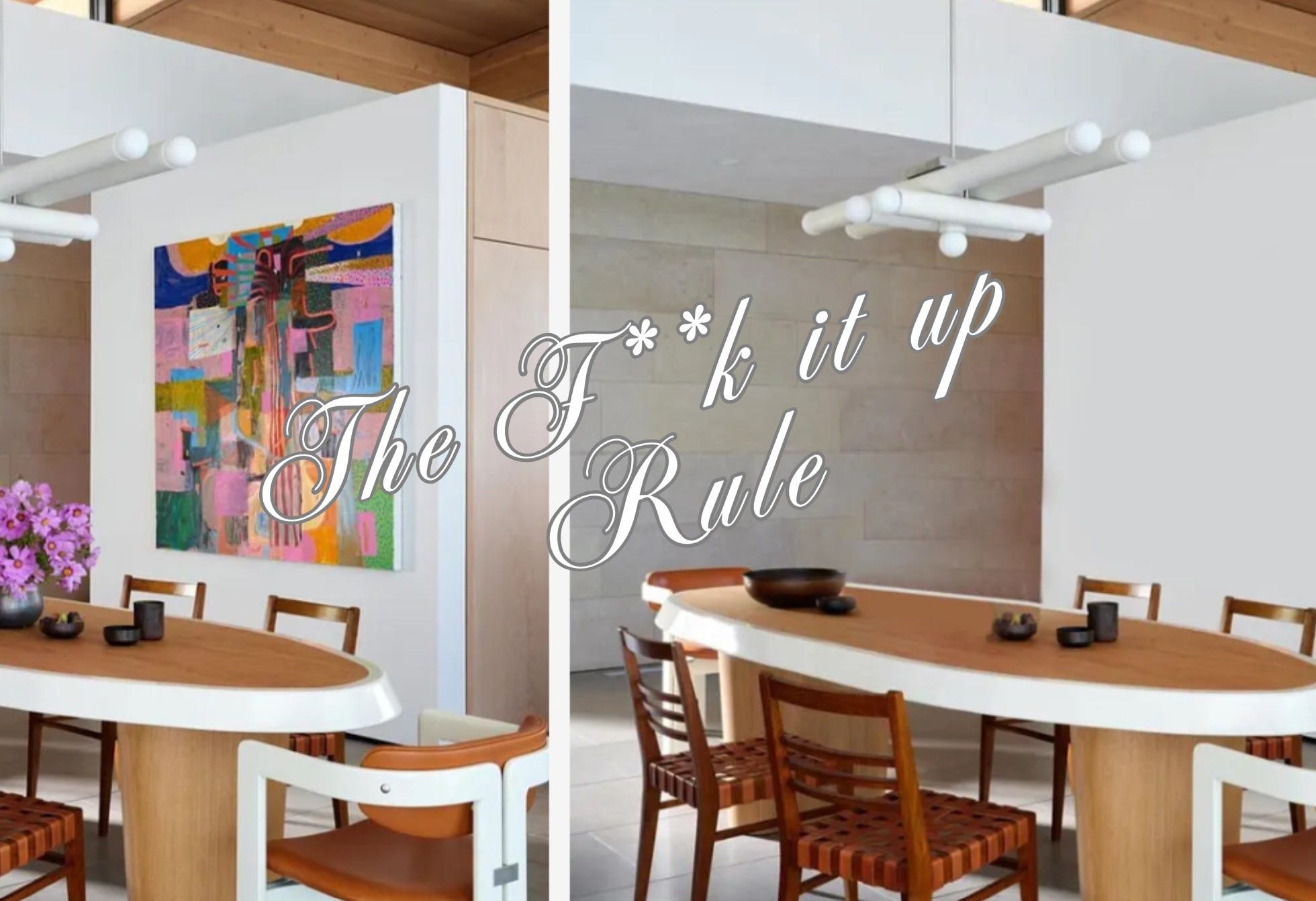
Method 3 - Art


The f*nk it up rule can also be accomplished through art or a colorful accessory if you’d rather keep furniture neutral.
The dining room above was from my time working with Sara Story Design. This project was located in Boulder, Colorado, so working with earthy tones and texture throughout the home made sense, while we introduced vibrancy through art selections (our intern at the time and art aficionado, Arielle O., advised on this piece. so good).
The space would feel… chic, but boring… without that pop of color on the wall.
Method 4 - Budget friendly florals
If you’re waiting for the perfect piece of art, a simple vase of flowers does the trick and allows you the time (and budget) to experiment with pops of color that work best in your space.
Method 5 - Inverse the style
Is your space mostly contemporary? White walls, straight edges, primary colors or no color at all? Introduce a vintage piece or family heirloom to create juxtaposition so the space doesn’t fall flat.
And vice versa if you have a traditional home in the North East with moldings galore. A contemporary piece of art, furniture, or a light fixture adds tension and interest to an opposing backdrop - in a good way!
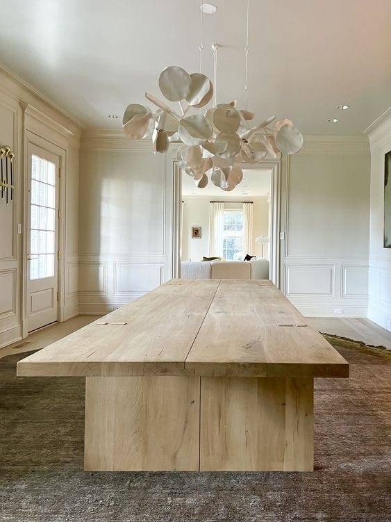
More examples:


All to say don’t be afraid of introducing an edgy element. If everything is matchy matchy in your home, take this as a sign to buy a throw that throws it all off. I promise it’ll elevate your space from feeling like a showroom to being showcased in Arch Digest.
#MakeItNotMakeSense
And as always, don’t hesitate to reach out if you’d like more in-depth help with your home. It’s both my day job and the obsessive thoughts that keep me up at night.
xoxo,
Wendie