


3 Creative ways to paint a room
With examples that say "decorative artist" or "thanks! I hired an interior designer" rather than DIY


Not long ago (okay, yesterday), I’d feel around the pocket corners of my purse – you know, where all the bobby pins, fuzz balls, and that one pistachio shell hide – in search of a spare dollar. I wasn’t homeless, but a caffeine addict who reasoned lost cash = free coffee. It’s a problem, and I relentlessly escape rehab.
This poor financial decision was a weekly occurrence when I lived in NYC. Afterwards, on a weekday, I’d walk across Chelsea to Madison Square Park and up an (excruciatingly slow) art deco elevator to work, where my day job included purchasing a light fixture or piece of furniture sometimes costing north of $100k for clients. Ludicrous - you said it, not me. When I first started, I’d sit semi-stupefied before clicking into complete checkout. Something about a table lamp equivalent to my monthly rent would cause for pause.
I digress.
The contrast of day-to-day life as an interior designer in NYC versus living in a walk up with a fan1 strapped to the corner of my bed was not lost on me.
Because my budget didn’t allow me to “get the look” with items we sourced for clients (some would blame the iced lattes), I had to innovate design solutions in our apartment, leaving the vintage $50k chandelier to sit in cart (one day! hold tight, bby).
Thanks to that day job, I have a more discerning eye - meaning most DIYs don’t cut it. They’re usually obvious and high risk (take too much time) and/or low reward (look dumb). Instead, we’re aiming for cost effective yet easy while totally transforming a space. I wanted friends to walk in, forget they knew my occupation, and wonder aloud “wow, does a designer live here?”.

Answer: PAINT
But we’re not talking accent wall (and never will), or even all walls… not exactly. You see, there’s a way to decoratively paint so that the room is manipulated to your advantage.
1) Color blocking
Rule numero uno: Dark color brings walls in, and lighter colors visually expand a space.
So apply this to your advantage! For example:
Dimore Studio has mastered the art of where to end one color and begin the next. A paint color doesn’t have to continue from floor to ceiling. The traditional transition of color in that corner where the wall meets the ceiling creates a harsh line and emphasizes your ceiling height. Take a shot of crazy juice, and end your wall’s paint color at a wainscot height (1/3 up the wall) or higher and then begin another color that continues up and — this is important — over the ceiling. Shifting that color transition’s location will manipulate the eye for ceilings that are unusually high or low.
Like these images below. See how the ceilings are higher than usual? Dimore used a darker color on both the ceiling and top half of the wall, which brought the weight of the ceiling to a more intimate level. And I love how they used a high gloss paint in that second image. The light bounces across the room and makes it feel more expansive while still bringing the ceiling downwards with a warm dusty color above. Drooling over here.


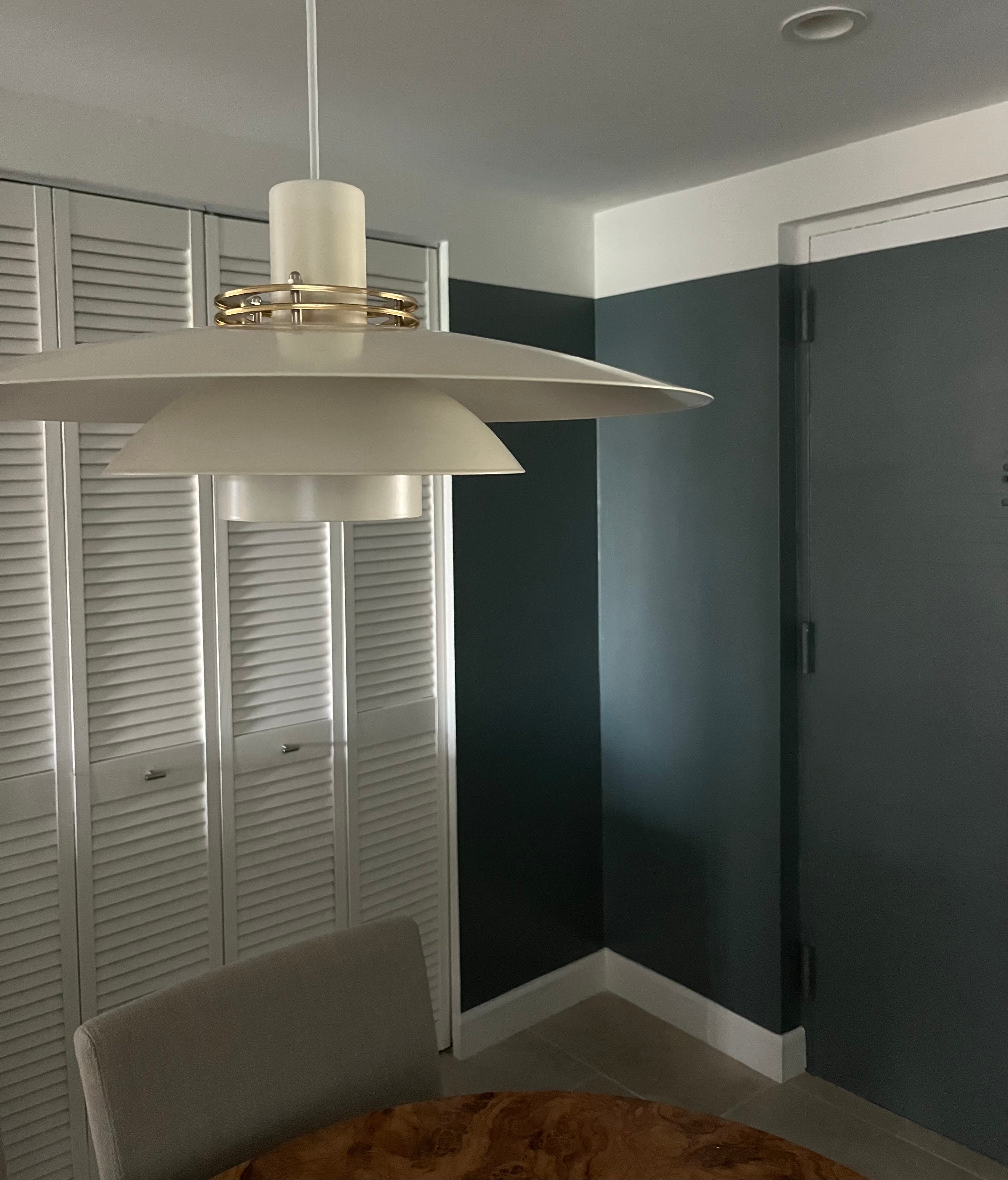
Our dining room in Boca Raton has low ceilings, so I flipped this color method and used a dark F&B De Nimes on the walls (pic below) while keeping the top bit of wall white to match the ceiling. Now, that top portion of wall blends up into the ceiling and it’s exact height isn’t highlighted in the corner by a harsh change in color. A friend commented that the ceiling felt higher (win!). And adding color to the walls allowed it to feel more inviting and less all-white-wall insane asylum (double win).

2) Ceilings - when they go high, you go higher
If we had higher ceilings I would have gone more in this direction. Stunning and an easy DIY if you set aside a day (or two). You could 1) get decorative on the ceiling, 2) lower your color transition on the walls, or 3) use a darker color on the top half of the space.


Note: you can add a chair rail molding where the color changes as shown in 131 Design’s bathroom, but I think that works best in home’s with more traditional details. I see the door in that room and it makes sense. The molding blends in well with the architecture. Whereas, we live in a more modern white box, so a clean cut of color (as we saw in Pierre Yovanovitch’s dining room, above) gets by as a contemporary choice.
3) Wall Murals (fav!)
I had a bird phase in New York due to DeGournay, Fromental, and Gucci coming out with all the cranes circa 2022, and began painting birds in our bathroom… not as bad as you’d imagine. Bryan ended up being a big fan (to my face at least), and we both got into bird watching. Random but cool. Pairs well with our 9PM bedtime.
For the bathroom, with classic NYC black and white tile, I painted all walls and ceiling a dusty blue with black and white cranes flying above. We’ve since left the apartment… the shame being you can’t take a wall mural with you, and the glory being that the new renter asked the landlord to repaint everything BUT that bathroom❤️. Lie or not, I can now RIP.


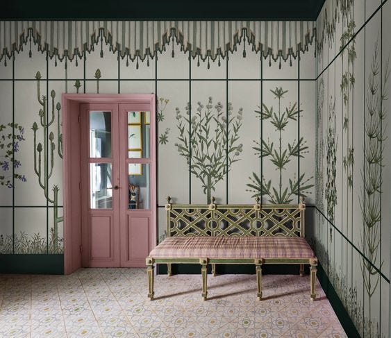
My current obsession is Pictalab in Milan, Italy. Orsola Clerici is a master of color combos and designs spectacular scenes like Portaluppi Herbarium, below. Not sure where the cup of courage came from, but I’m thinking I can put my own twist on it and create a gardenesque feeling in our Boca guest bathroom… maybe add Florida flora and fauna? What do we think? I’d nix the tent-like-top (love, but doesn’t make sense in our home) and continue the lines across the ceiling… maybe paint a bird flying above. The goal being for you to feel encased in a glass room with a wild Floridian landscape just beyond.

One more thing…
If wall murals seem intense, but you still want more a more decorative finish, another trick when painting your room (if wallpaper isn’t within budget) is to look at existing wallpaper patterns or art you love, selecting one that’s less detailed and could be stenciled, easily outlined, or spun off of. An idea can spring from gathering these images, or you could combine elements from two patterns to create a design of your own.
Here’s a few I’ve considered: (click through their website links for more inspo)
*I didn’t add a ticking stripe, but that would be oh so easy and doubtlessly stellar.


Let me know if any of this seems feasible and if so, which direction you’ll go. And don’t forget, paint can be painted over! So consider it a cost effective and (at least mildly) stress free solution. Low risk, high reward.
I only warn that you could spend hours staring at your blank walls… endlessly scheming. Or maybe that’s just me.
xoxo,
Wendie
I wish I had an image of this. It was a 3 and half foot high fan meant to stand on the floor. I had it in the corner above my bed, inches from my pillow, and directed towards my body every night on high during sweltering NYC summers. No regrets. The iced coffee kept me going.
Love these different examples - Currently updating my home and have bookmarked to reference back later!